


Book Design
Project Type: Editorial / Print Design
Role: Graphic Designer
Tools: Adobe InDesign, Adobe Illustrator, Adobe Photoshop
Overview
Designed a book layout focused on readability, consistency, and typographic structure across multiple pages.
Challenge
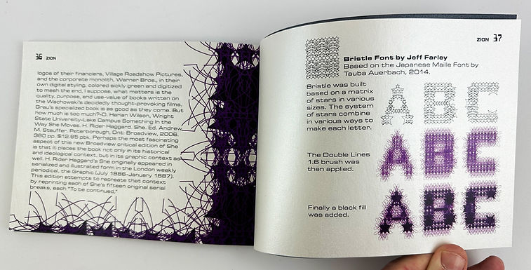
Maintain visual consistency and strong typographic hierarchy throughout a long-form printed piece while supporting comfortable reading. Japanese Stab Binding done by hand with a star design to coinscide with the font design.
Solution
Developed a structured layout system using consistent grids, margins, and typographic styles. Careful attention was given to spacing, alignment, and pacing across spreads.
Production Details
• Multi-page editorial layout
• Consistent grid and style systems
• Typography optimized for readability
• Print-ready file preparation
Outcome
Delivered a cohesive book design that demonstrates strong control of layout systems, typography, and print production standards.


Typography & Font Development
As part of the book design, I developed a custom typeface to support the tone and readability of the publication. The font was designed with the idea of teetering on the edge of aesthetics and legibility in mind, emphasizing the font as a design element.
Created in Illustrator, Bristle was built on a matrix of stars in various sizes. The system of stars combine and subtract in various ways to form each letter. Inspired by the Japanese Maille Font by Taube Auerbach, 2014.
The typeface was tested and refined directly within the book layouts to ensure it performed effectively in headings, supporting text, and design. Adjustments to spacing, weight, and proportions were made based on real print application rather than isolated character displays.
Tools: Adobe Illustrator
Focus: Typography as design, print performance


The Double Lines 1.6 brush was then applied.

Finally, a black fill was added.